Designing an effective cover—one that piques curiosity and makes a good first impression—is no easy feat. In the case of my novel Marion Hatley, it involved puzzling over multiple possibilities for the cover and, in the process, figuring out the best “face” for the book—one that was inviting and intriguing, and offered subtle hints of the story inside.
How might we suggest Marion’s presence?
Early on, my publisher, Laurel Dile King, and I discussed how we might give the novel’s central character a presence on the cover while leaving something to the imagination. (A common criticism of main-character-on-the-cover designs is that they can get in the way of a reader’s personal experience with/visualization of the character.)
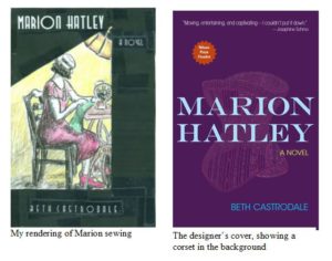
One possible solution? Have Marion don a low-riding cloche, a style of hat in keeping with the novel’s 1931 setting. Armed with my 64-count box of Crayola crayons, I took a crack at roughing out such a cover, hoping to come up with a concept that Laurel and I could turn over to a professional designer.
We were fortunate that William Boardman, an incredibly talented cover designer with whom I’d worked at college publisher Bedford/St. Martin’s, was able to take on the job. Based on my rough drawing, William created several versions of cloched Marion, which perfectly captured my vision of her. (I show just one version in this blog post.)
Laurel and I really liked these covers. But we figured we should try out a few other concepts to be sure we were making the best choice. Also, we thought we should run the various designs by other folks, both those who’d read the novel and those who knew little or nothing about it. (More about this later.)
Should the cover suggest more about the story … or less?
As Laurel and I discussed other possible cover concepts, we wondered if the cover should suggest sewing and/or corset making, two important aspects of the novel. So I went back to my crayons, and William went back to his design software. Voilà!

Not bad, thought Laurel and I.
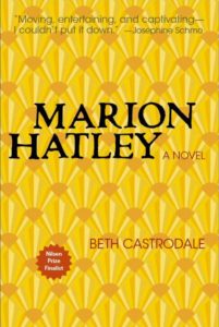
Then again, might the minimalism of an all-type cover be a better choice? It would certainly leave more to the reader’s imagination. Also, it might slightly reduce the likelihood of the novel being swatted, subconsciously, into the category of “women’s fiction,” which, as novelist Meg Wolitzer perceptively noted, “subtly keeps female writers from finding a coed audience, not to mention from entering the larger, more influential playing field.”
In response to our curiosity about minimalism, William came up with a type-centric cover. Its background suggests the expandable fans that Marion includes in her revolutionary “Whisper Lift” corset—a bit insider-baseball perhaps, but I loved what the fans brought into the mix, visually and conceptually.

The designer works his magic.

At this point, Laurel and I had several attractive covers to run by friends, loved ones, and other potential readers. (I haven’t shown all of the options here.) But through all of the experimentation, my personal favorite remained the versions of the cover showing cloched Marion.
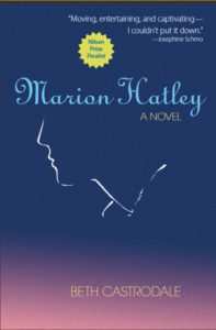
William understood the appeal of these versions, but as he said, “they didn’t convey the sense that Marion’s life had a hidden aspect, something waiting to be discovered.” So he came up with a cover that reduced the more representational portrait of Marion to, in his words, “a simple gesture hanging in the wind.”
I fell in love with this cover as soon as I saw it, and I was struck by William’s uncanny ability to immerse himself in Marion’s story, and in all the ideas I’d shared with him about what the cover might be and do, and come up with something so subtle, suggestive, and inviting. (Incidentally, the drawing of Marion-in-profile is his.)
The voters weigh in.
More than 30 people reviewed and voted on a field of covers that Laurel and I had narrowed to four: (1) the more representational portrait of Marion (i.e., cloched Marion), (2) the subtle-outline profile that William created, (3) the type-centric cover, and (4) the cover that showed a corset in the background.
Most voters chose options 1 or 2, with option 2 having a slight edge. Although I would have been happy with option 1, I loved the mystery of option 2, and I hoped that it might spark more curiosity among potential readers.
Mary Lou Nelson, a friend and masterful painter who shared the cover options with both her reading and art groups, also preferred option 2, noting how Marion-in-outline reminded her of the Sherlock Holmes logo, an image that offers a bit of intrigue.
In the end, Laurel and I chose option 2.
We make some final tweaks.

Now that Marion was freed of her cloche and marcelled hair, the cover no longer suggested the era of the novel. But the title type of the option-1 cover did. So William brought that type into the option-2 cover, making small adjustments to it and other aspects of the cover. One striking change was his use of yellow title type on the blue background, echoing the cover of The Great Gatsby. The yellow also makes the title stand out, even in thumbnail versions of the cover, which appear in marketing materials and on the Internet.
I enjoyed being part of the process of designing the Marion Hatley cover. I learned a lot from the endeavor, which has given me new respect for the power of simplicity, and for the advantages of suggestion over specificity.

One thought on “The Story of a Book Cover”
Comments are closed.